The Learning Center
AKA... The Blog
AKA... The Blog
Every business has to have a brand created for them at some point in their existence. A brand is what a business stands behind for their target market to connect with and recognize them. But what happens when that brand is recreated? Is it a smart move or detrimental one? Is it best to always stick to the classics?
From the companies we’ve looked at, plenty of them have succeeded in recreating their brand. However, for the sake of learning, we are going to focus on the brands that failed in consumers’ eyes. So while you may think some of these were a success, the majority of people would say otherwise. Here are 7 brands who failed at rebranding themselves and what they did wrong.

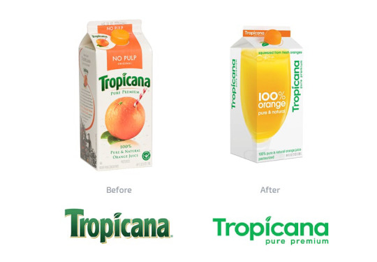
Tropicana is a well-known brand popular for their straw sticking out of an orange. This classic image was to portray the fact that their orange juice is 100% juice. But in Jan 2009, the company decided they needed an image makeover––a full rebrand. The actual orange became less obvious as its only reference was moved to the cap of the juice container. And rather than show the usual outside of an orange, Tropicana decided to show the actual product, a clear glass full of orange juice. The new message focused on that the juice was freshly squeezed, accompanied by the campaign “a squeeze is natural” displaying families hugging.
The problem was that people didn’t recognize the new Tropicana brand. All at once, they had changed their logo, packaging, message, and typography. So when customers went shopping for orange juice, they picked from Tropicana’s competitors. Many reported that the new packaging looked like a generic or store brand, not the premium product Tropicana advertises to be. When sales dropped by 20%, Tropicana realized their brand was in trouble and reverted to their original branding by the end of the next month, throwing away their 35 million dollar investment into the rebranding campaign.
So what went wrong? For one, the drastic rebrand made them unrecognizable. Secondly, they underestimated the emotional connection their customers already had to their original brand. And third, in an attempt to look modern, they made themselves look cheap.

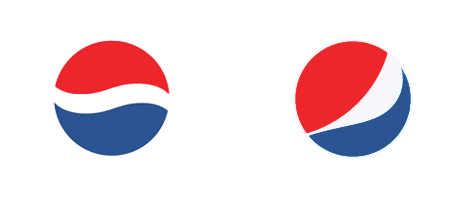
Pepsi’s most recent logo is one that didn’t fail due to how it looked, but rather due to the market’s confusion over the price tag and strategy behind it. Most people have a hard time understanding why Pepsi spent a million dollars for their existing logo to simply be tweaked. If you didn’t see the original logo side by side with the new one, you may not even realize there was a change. The only change was that the wave going through the middle of the logo became more of a swoop. So why pay a million dollars?
What those who aren’t in the design world often fail to realize, and reasonably so, is that the price tag for a logo isn’t for the final product but rather for the thought and time that goes into its creation. Arnell, the agency responsible for the logo update has a 27-page design strategy behind the logo that refers to the renaissance, the golden ratio, earth’s gravitational pull, and so many other scientific reasonings to create the perfect “breathtaking” angle. So was all that thought process pointless? Possibly. Could they have stopped halfway in that process and ended up with the same outcome? To judge for yourself the thought process behind the logo update, read through Arnell’s “breathtaking” design strategy.
The strategy behind the logo rebrand didn’t stop with their scientific reasonings, though. Once they had created this new logo, they created more to look like different smiles under the campaign of “One identity; multiple emotions.” Unfortunately, no one quite got that branding strategy either.

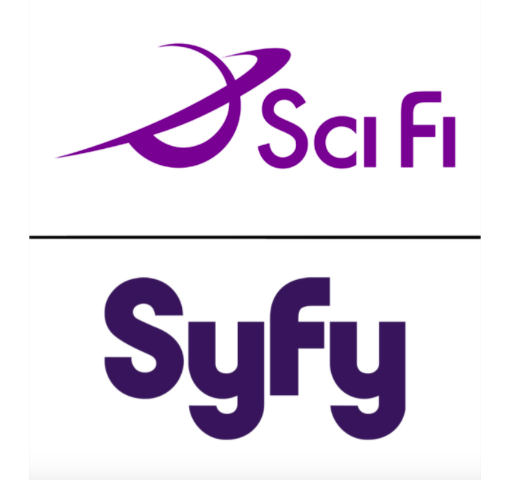
The SciFi channel’s decision to rebrand themselves wasn’t a bad choice. They needed to trademark their name and couldn’t. But instead of coming up with something more original, they decided to go with a misspelled version of their name. The problem: either no one looked up their new name on the internet or they didn’t care to concern themselves with the fact that their new name “SyFy” is slang in most parts of the world for syphilis. So while they were going for a more hip and cool vibe they could trademark, this TV channel can’t avoid the immediate association with an STD.

When the logo for the 2012 Olympics was released, it was believed to be universally hated by the world. There is no way to tell if everyone hated it, but plenty of hate rose up over the logo to show it wasn’t widely accepted. The logo was an attempt to be modern but ended up looking too urban, too young, and not representative of London where the Olympics were being held that year. With all the harsh lines and slantedness of the symbols, no one could be for sure what message it was trying to convey besides “2012.” Some believed they saw other words in the numbers, while others saw other symbols. And some may have just been joining in on the logo hate for the sake of being cool and fitting in. What do you think of the 2012 Olympics logo?

RadioShack has slowly been decreasing in popularity over the years as they seem more and more irrelevant compared to the modern brands in the technology business. Knowing they needed to find a way to compete, they tried to rebrand themselves as “The Shack” while pairing their campaign with Shaquille O’Neal, otherwise known as “Shaq.” Their attempt at being a modern brand failed. While “the Shack” may sound more modern, it doesn’t sound like a place you’d want to purchase high-quality electronics. As an old brand, RadioShack can’t seem to revitalize themselves to succeed in the midst of sellers like Best Buy, Apple, Amazon, Verizon, and so many others. It’s no wonder they are slowly disappearing from existence.

When your brand has a bad reputation, you need to do a lot more than change your name. But that’s exactly what Comcast did when they realized they needed to do something to save themselves from negative customer opinions. They changed their name to Xfinity in an attempt to make people forget how much they hated Comcast. It may have worked for a while, but Xfinity has only seemed to adopt Comcast’s reputation. If you need a reputation fix, you need a strategy change, not a name change.
![The 30 Best and Worst Rebrands of All Time [Infographic]](https://blog.hubspot.com/hubfs/%5BAgency_Post%5D/Blog_Images/gap-rebrand.png)
In 2010, the logo everyone knew and loved to be The Gap suddenly changed without warning. It may have been this suddenness that made everyone cringe and cry “ew, no! Why?” The Gap is a pretty iconic logo to change. And they discovered the hard way just exactly how much their customers connected with the classic “GAP” over the navy square. The second that navy square became a tiny thing in the corner, customers lashed out and demanded a change. Some customers went a little overboard, saying they would never buy Gap clothing again. Whether those customers meant it or not, The Gap repented and asked their fans for ideas on how to remedy the logo everyone balked at the sight of. In just 6 days, The Gap reverted to their original logo design, and all was well again.
For one, don’t change all your branding elements all at once (logo, packaging, message, typography, etc). Two, sometimes it isn’t your fault if your rebranding isn’t as well received as you might have planned. While the strategy behind it may have been a good idea, it doesn’t work if your audience doesn’t connect or recognize it. Third, people tend to hate what they can’t understand. If they don’t understand the thought process behind it or the money that went into it (anyone remember the Tennessee logo outrage?), they just won’t accept it. And fourthly, some people will just like to hate on logos and rebrands for no reason other than that they can.
So when it comes to rebranding your business, it’s all about knowing your audience and how they will respond. If they act out at your branding, figure out what it is they connect with and strengthen that bond.
Titan Web Marketing Solutions based in Murfreesboro, TN provides Professional Logo Design Services to businesses throughout the United States. If your company needs logo design help Contact Us today.
Titan Digital provides marketing services to businesses all throughout the United States. If your business needs digital marketing help Contact Us today.