The Learning Center
AKA... The Blog
AKA... The Blog
When it comes to converting an audience, nothing can make or break your online business quite like landing pages. They’re your strongest asset in crossing the finish line to conversions, but if they aren’t done properly, they can cause potential customers to change their minds and look elsewhere at the last minute. Landing pages look simple, but they’re one of the most challenging steps in the marketing process. Of course, the best ones are all unique, but they share some characteristics that are crucial for optimal audience conversion.
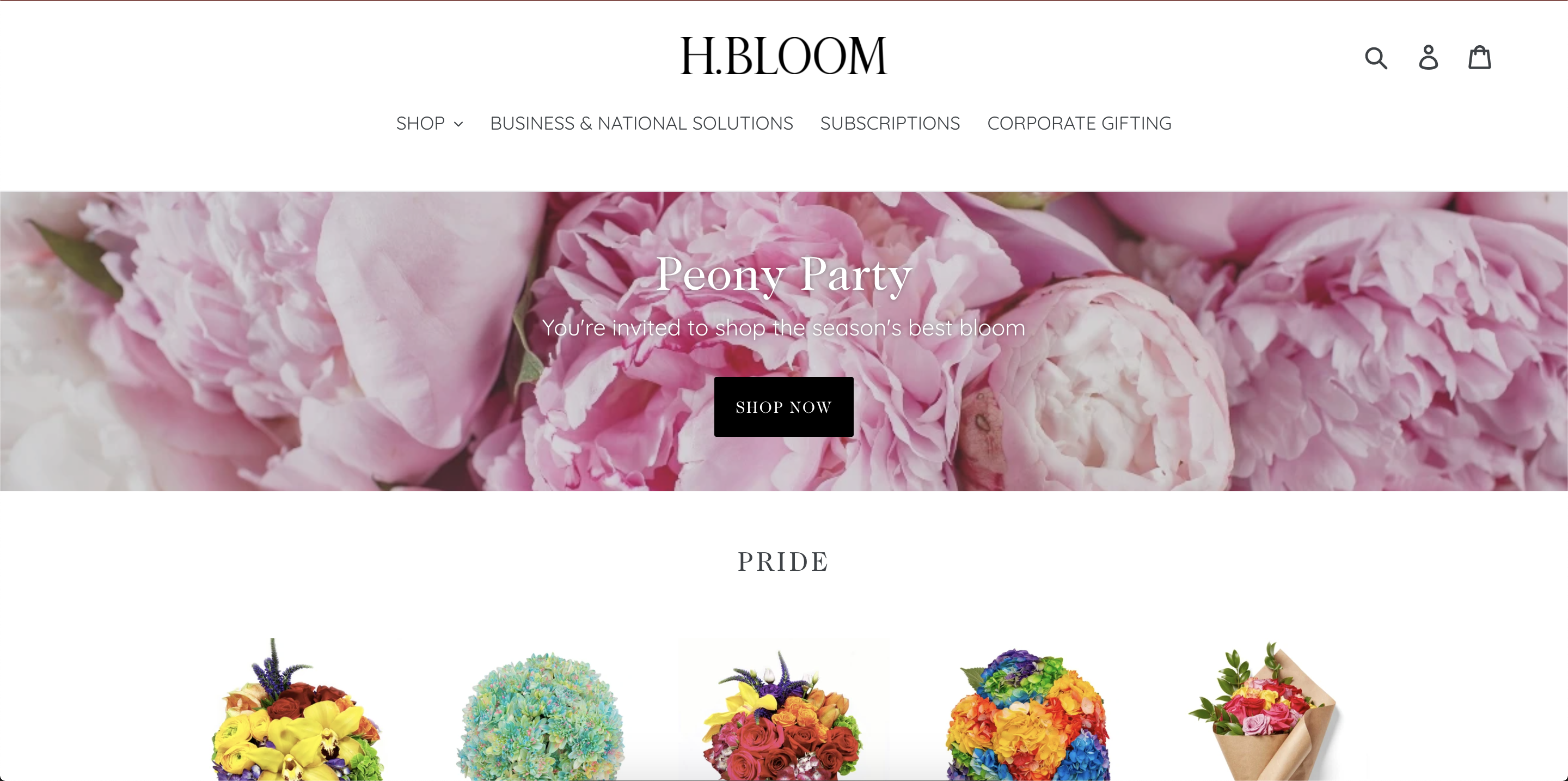
Effective landing pages exist for one purpose: to convince an audience to take a specific action. Whether that’s purchasing a product or simply giving a company relevant information, a landing page is only going to be focused on that action alone. The headline should be brief and catchy, like in the page by H. Bloom, below. It should then be followed by a subhead that gives your audience some more information about the action they’re about to take. Don’t distract them with unrelated information or alternative offers on your landing page.
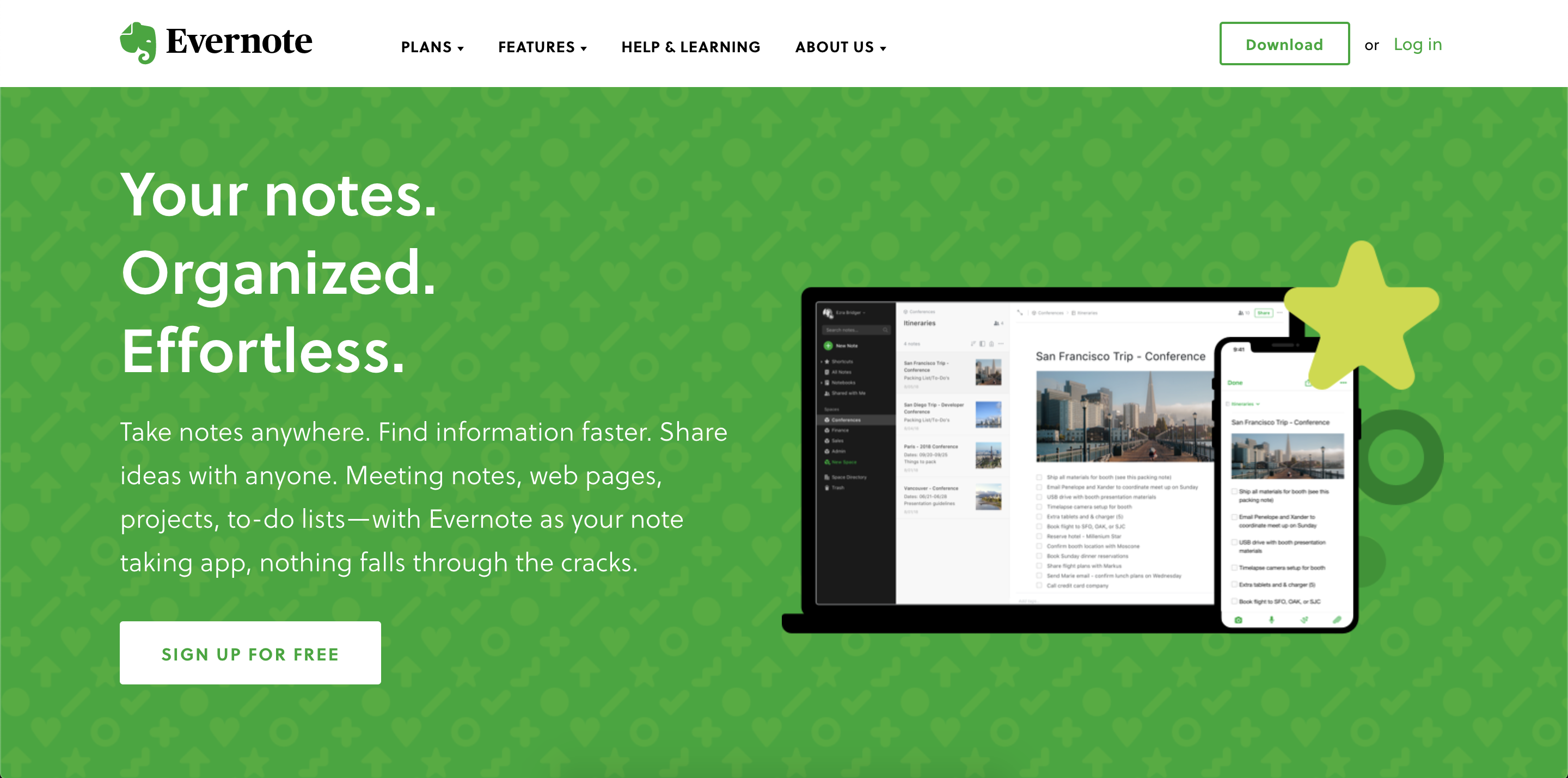
If someone has made it to your landing page, that means they’ve interacted with your brand enough to know that they’re interested in what you can do for them. Still, it’s essential that your landing page lets potential customers know how they will benefit from following through with the action they are about to take. This builds trust with them and makes them excited to grow a relationship with your company. See how Evernote packs a lot of benefits into very few words in their landing page below:
You might have some awesome media content or prose that would put a best-selling author to shame, but a landing page is no place for showing off the fancy tricks. The highest converting landing pages are the ones that customers can read and respond to in a matter of seconds (yes, seconds). According to user studies, most people won’t stay on a page if you don’t properly communicate your value proposition within 10 seconds. If the page is long, full of blocky text, or visually distracting, it can seem too tedious for most potential customers to bother following through.
The landing page is the last leg of the race to making a conversion, but remember that it isn’t over until the action is complete. Those awesome CTA buttons on your website and your social media ads are what got your audience here in the first place, so it’s time to finish strong. Use action words throughout the text on your landing page and give your CTA button language that tells the customer exactly what is going to happen when they hit submit.
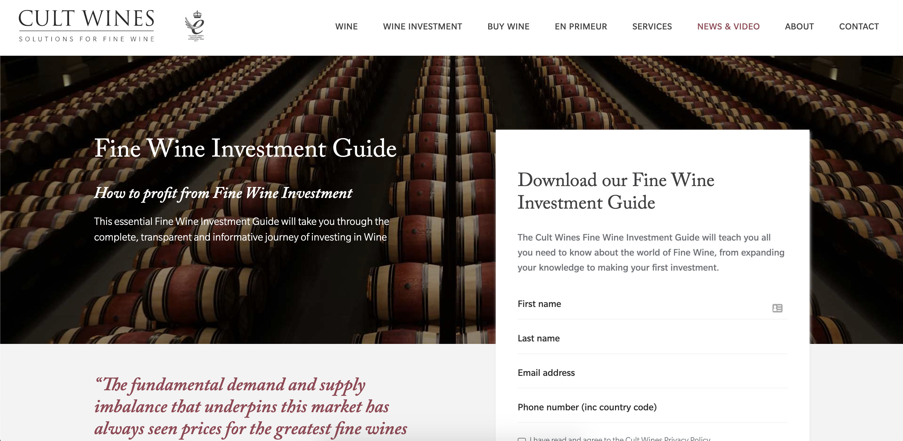
The formula for a landing page goes from top to bottom as follows: headline, subhead, text, testimonials (if applicable), and CTA button. Right? Wrong. The highest converting landing pages use different combinations of these components, and they certainly don’t read straight down. The expectation that your audience will start at the top, read everything you have to say, then finish nicely with a conversion is an idealistic one, but not likely to be effective in practice. Rather, most effective landing pages put an eye-catching CTA button up front and center, taking up a good portion of the page, like this info-grabber for wine investors:
Keeping in mind the steps that your audience took to get to your landing page, recognize that the CTA button and the information it’s asking for is usually the first thing they expect when they arrive. If it’s buried at the bottom, your audience is going to be thrown off and confused. Some landing pages will naturally need more information than others, but keep the structure smart. Every company is different, and every landing page has a different goal. Don’t get locked into the idea of a set structure. Rather, design the page to work efficiently for the conversion you’re trying to make.
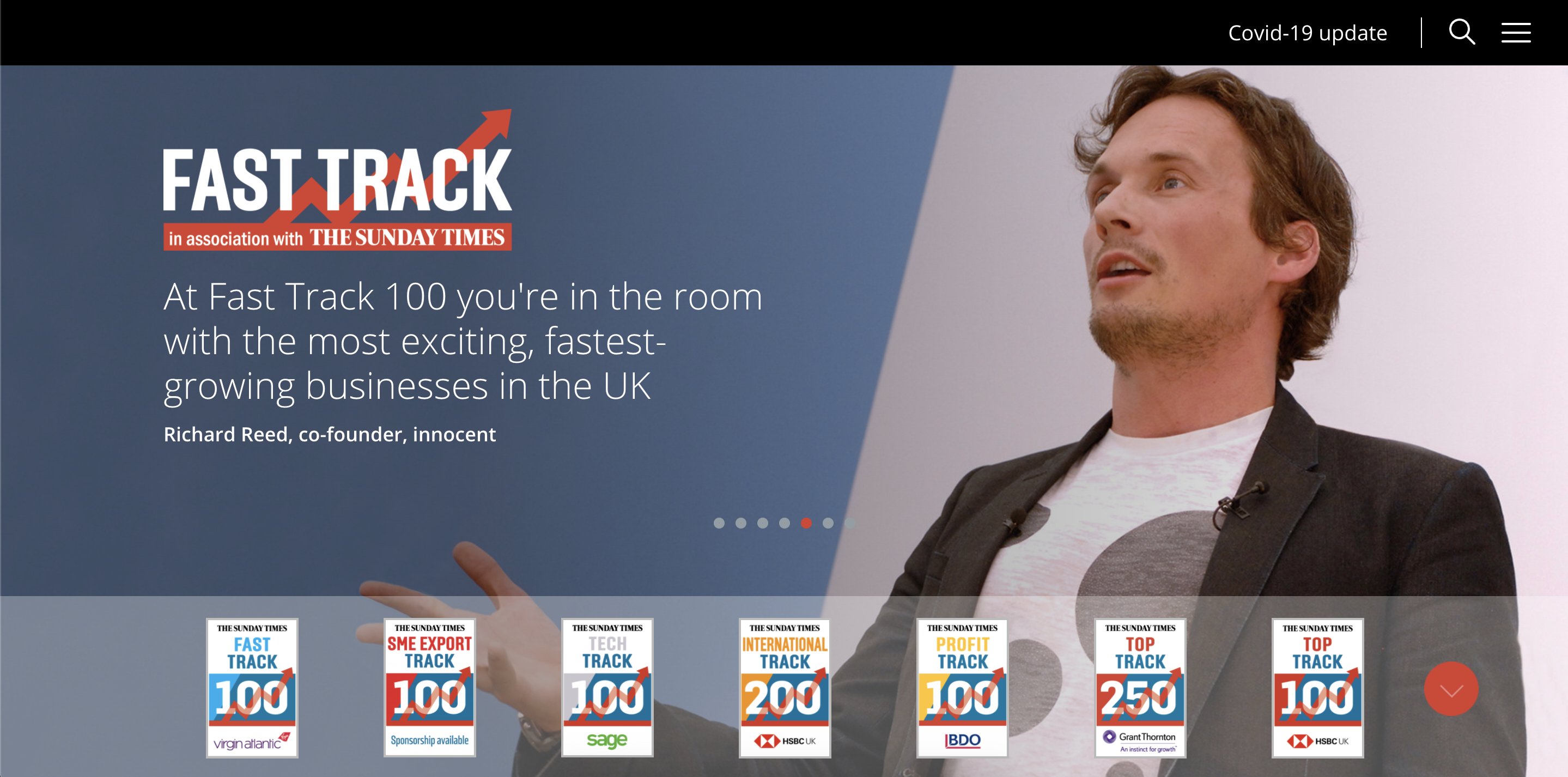
The internet can be a scary place full of scammers and spammers, so it’s important to let your audience know that your company can be trusted. The importance of your authenticity really comes into play when that audience reaches your landing page. This is a great spot to imbed brief, scrolling testimonials or small logos displaying your company’s experience and accolades. For example, if your company has been featured in the news, you can embed the titles at the bottom like Fasttrack did in the photo below. If you’re selling a product or asking for banking information, ensure that proof of your SSL certificate is visible on the page.
Your landing page is the jumping off point. Put yourself in your audience’s shoes. As a consumer, which pages do you trust? Would your landing page right now make you feel good about interacting with your company, or would it make you feel doubtful? Keep these six characteristics in mind moving forward to craft landing pages that effectively boost online conversions and help your business grow.
Titan Web Marketing Solutions is a Website Design Agency based in Murfreesboro, Tn that works with businesses all throughout the United States. If your company needs website design help Contact Us today.
Titan Digital provides marketing services to businesses all throughout the United States. If your business needs digital marketing help Contact Us today.